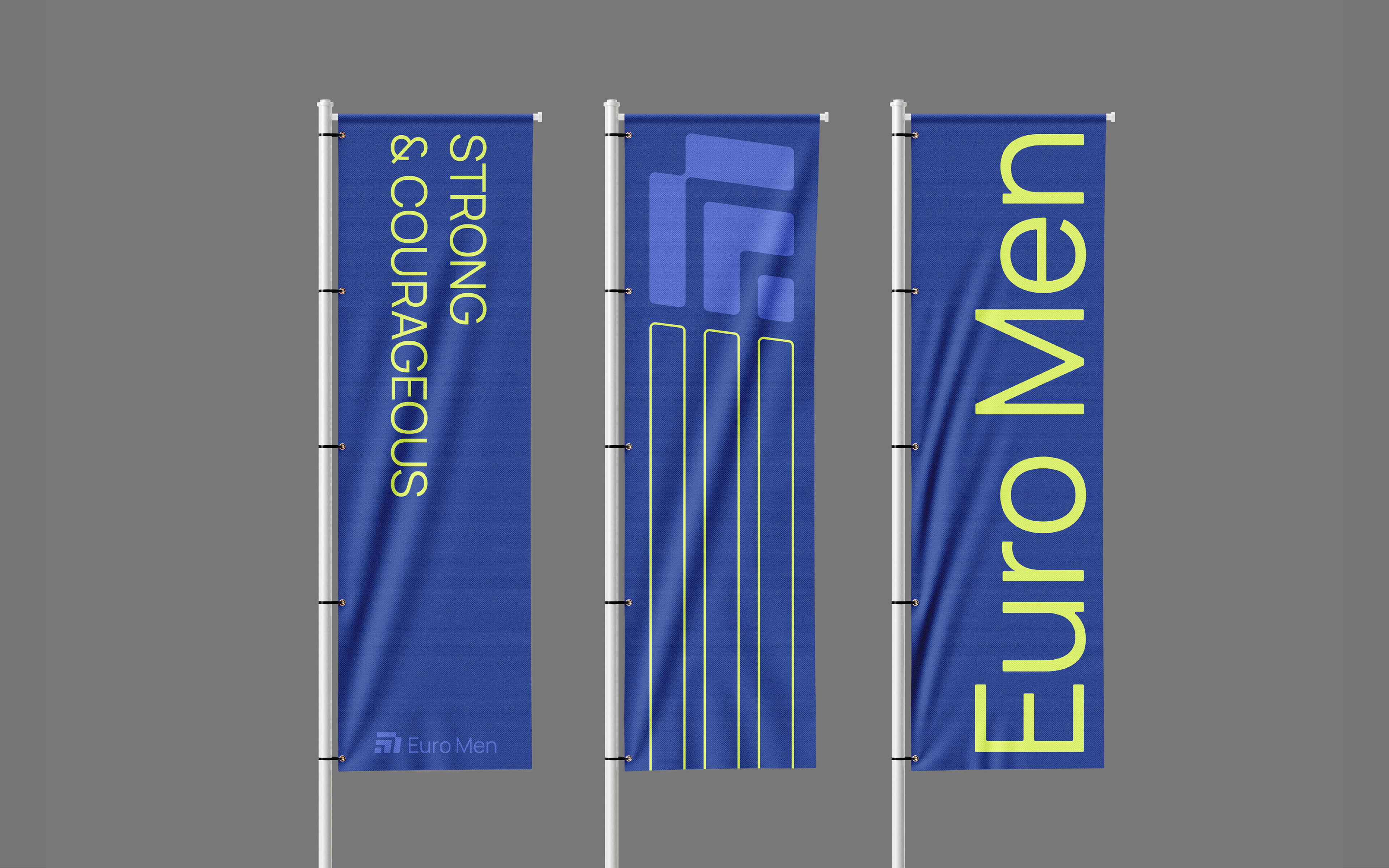
EURO MEN
Euro Men is the official men’s ministry of the UPCI. The objective of this project was to create a logo and visual identity that effectively communicate the core values and character of the organization.
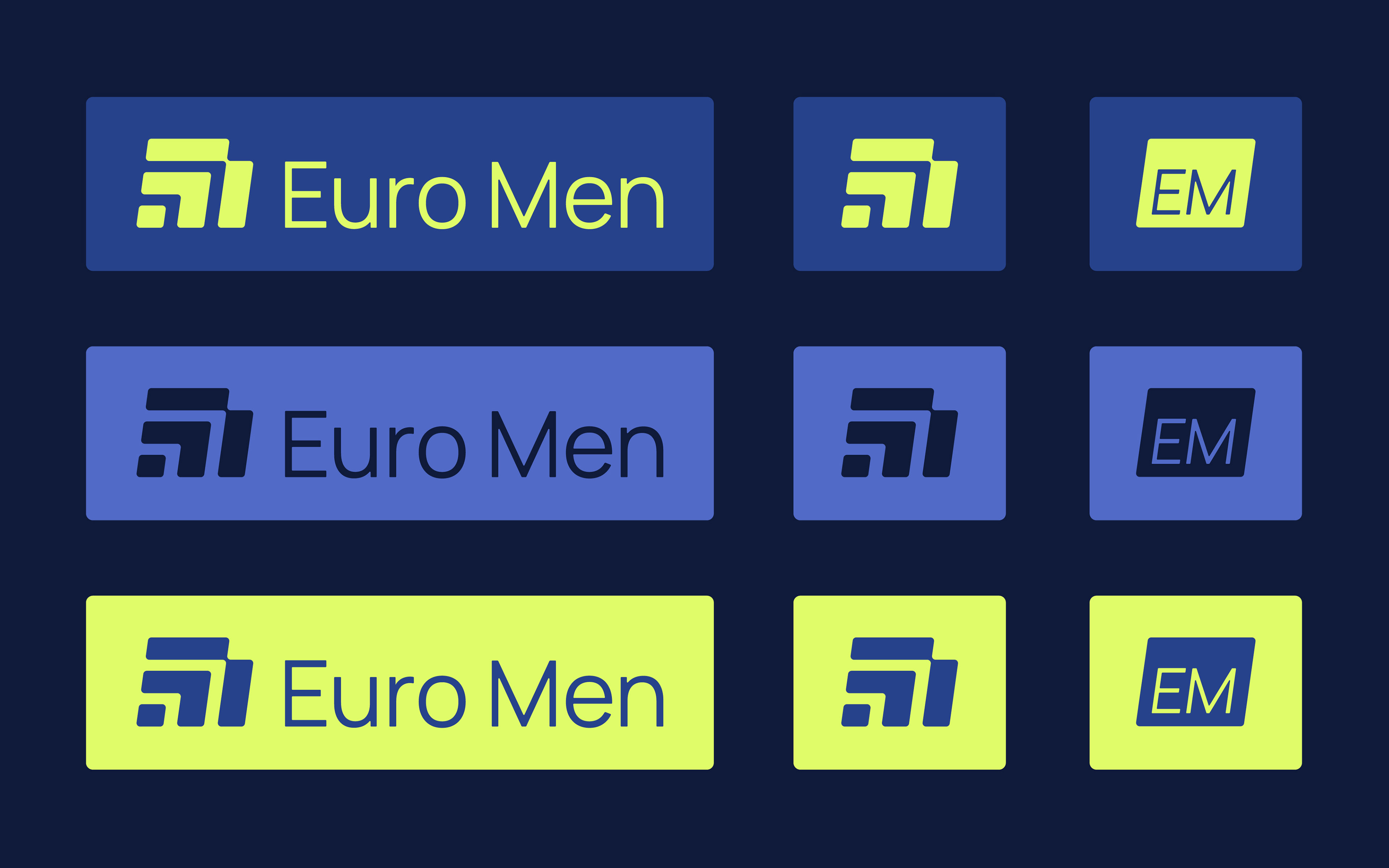
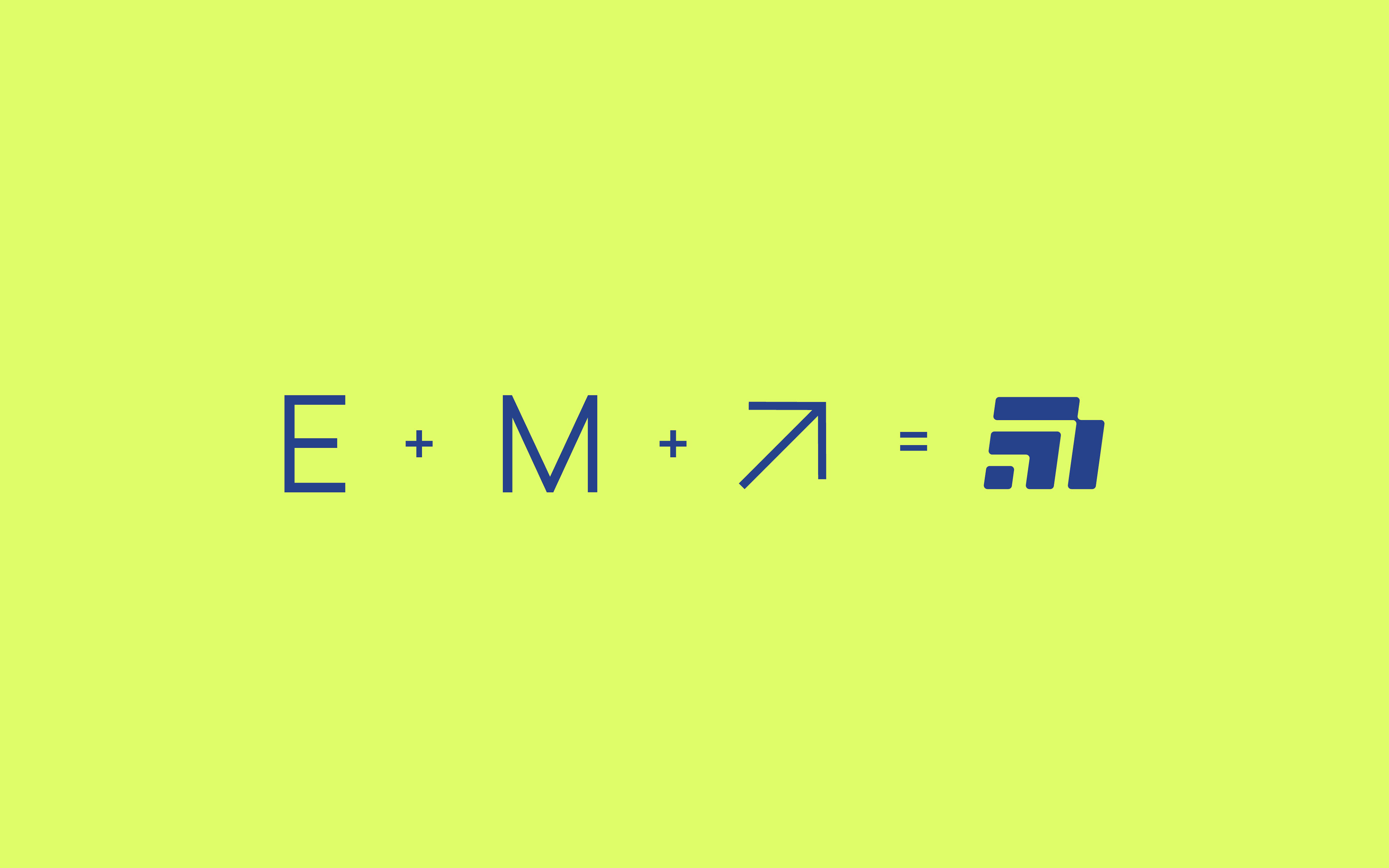
We began by designing the logo, which consists of a symbol (mark) paired with a logotype. The mark is composed of three abstract shapes that cleverly form the letters E and M. Its upward and forward-leaning design symbolizes progress, growth, and forward momentum. That reflects the ministry’s mission to empower and develop men in their faith and personal lives. The rounded edges of the mark soften its overall look, which introduces an element of gentleness and approachability to balance the brand’s strength.
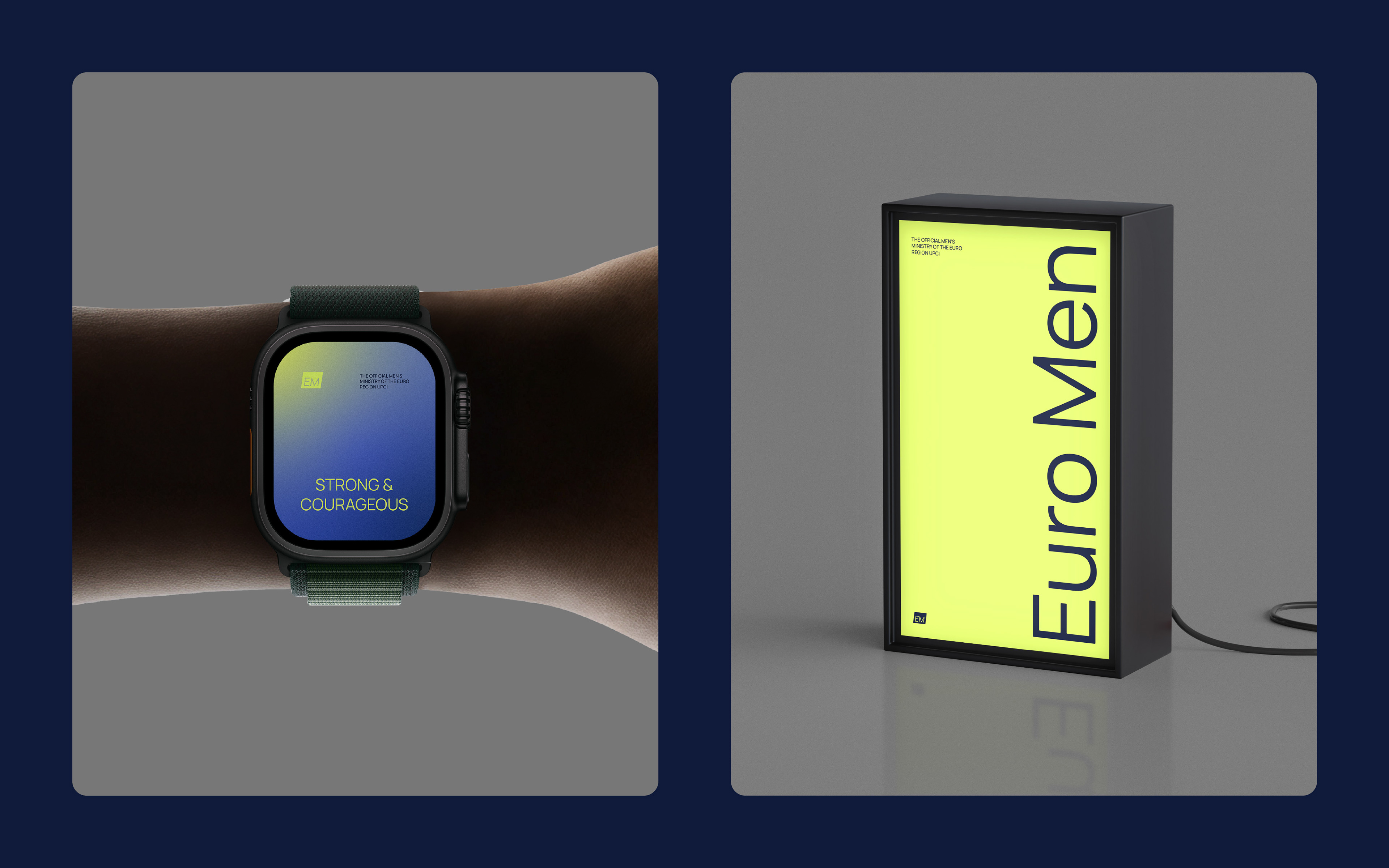
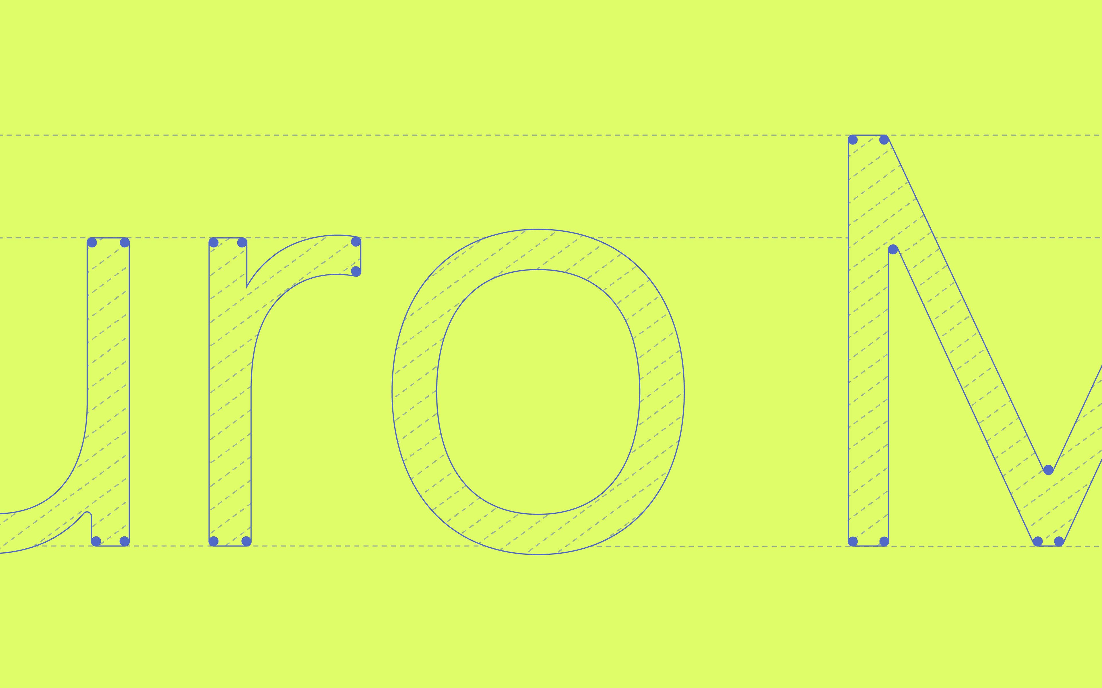
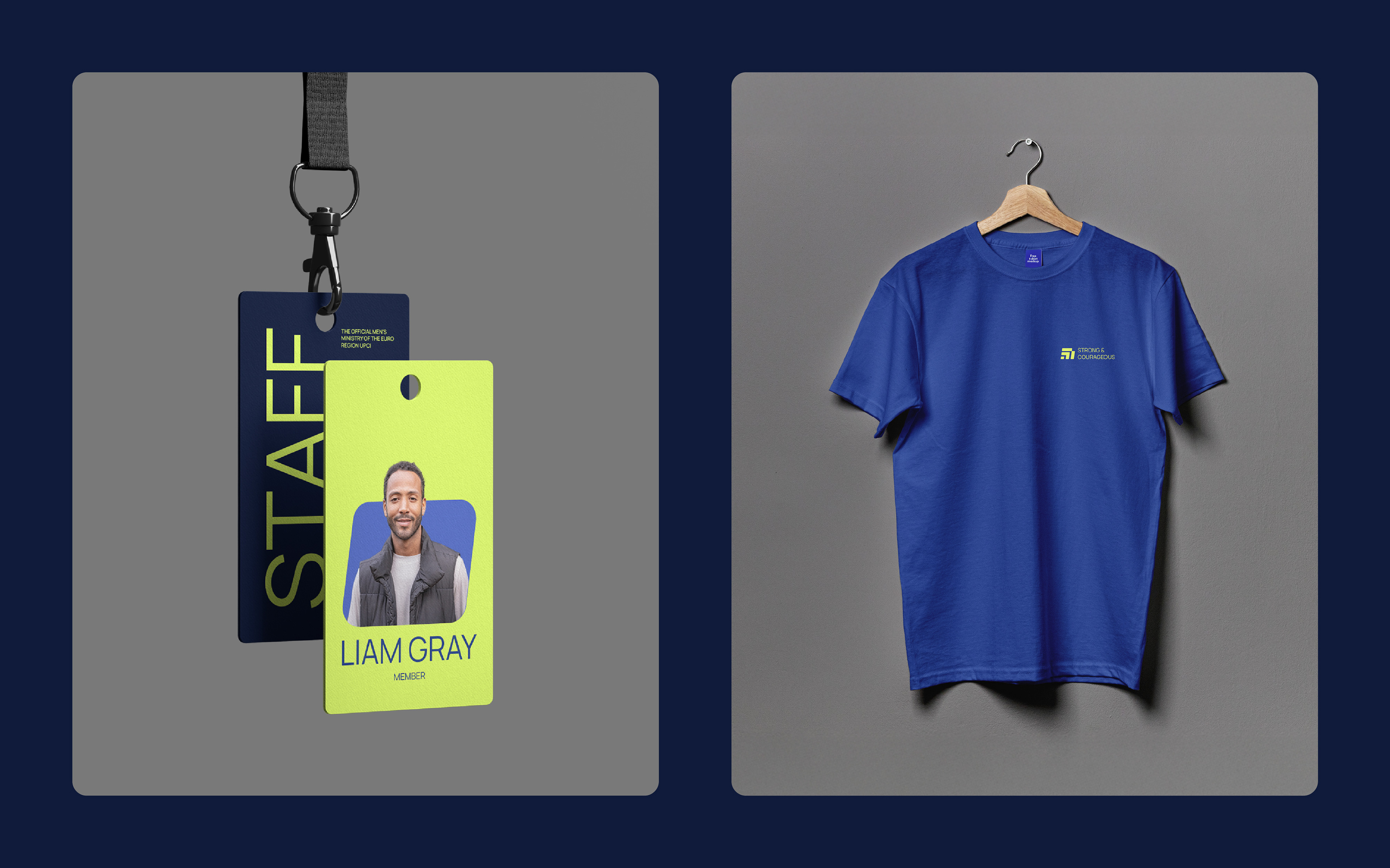
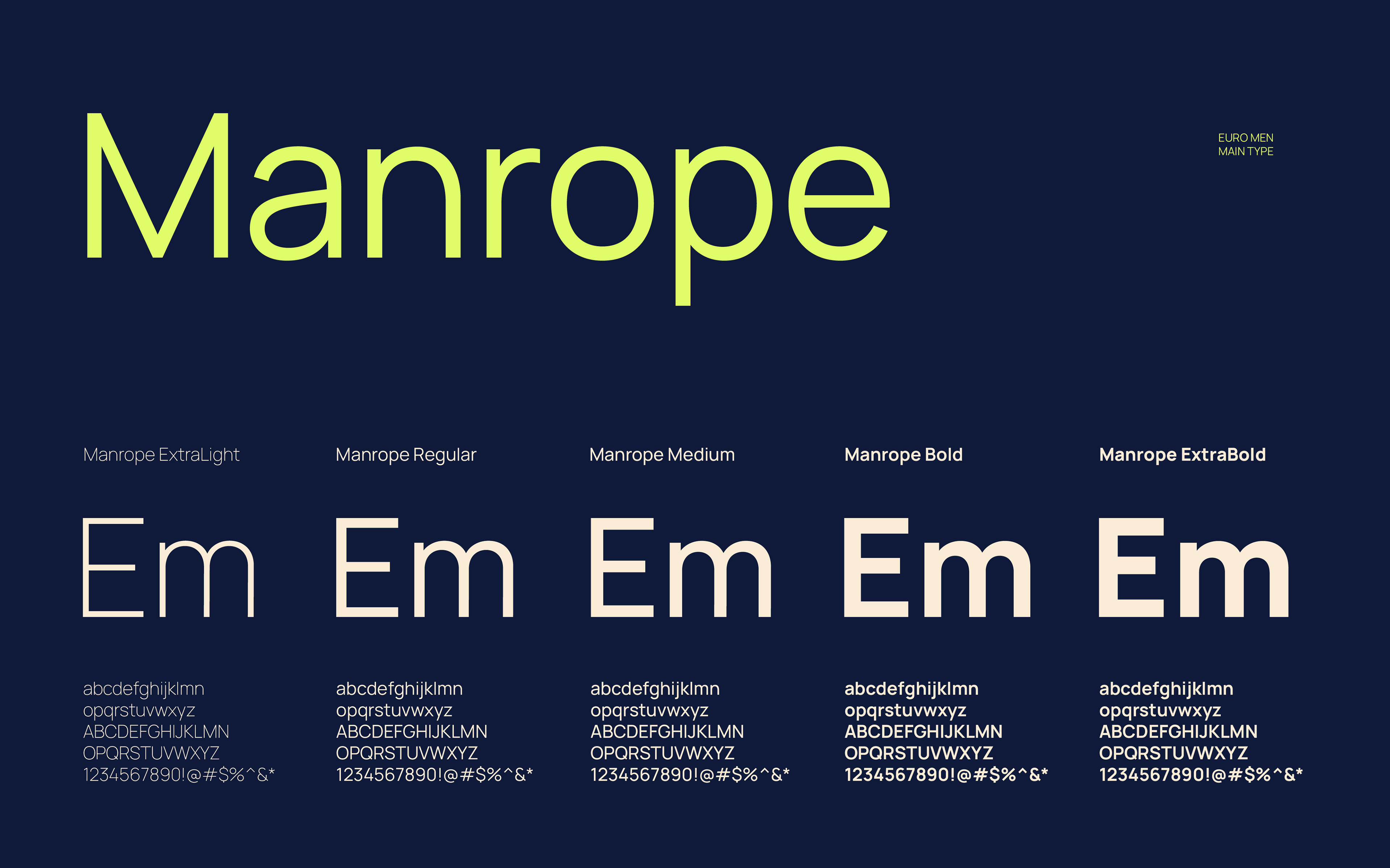
The mark is paired with a simple, clean sans-serif typeface. This combination creates a modern and professional appearance. Color choices were made carefully to enhance the brand’s visual communication. Shades of blue symbolize trust, stability, and spiritual depth, while a bright lime yellow brings energy, optimism, and a sense of renewal. These qualities are important for engaging and inspiring the community.
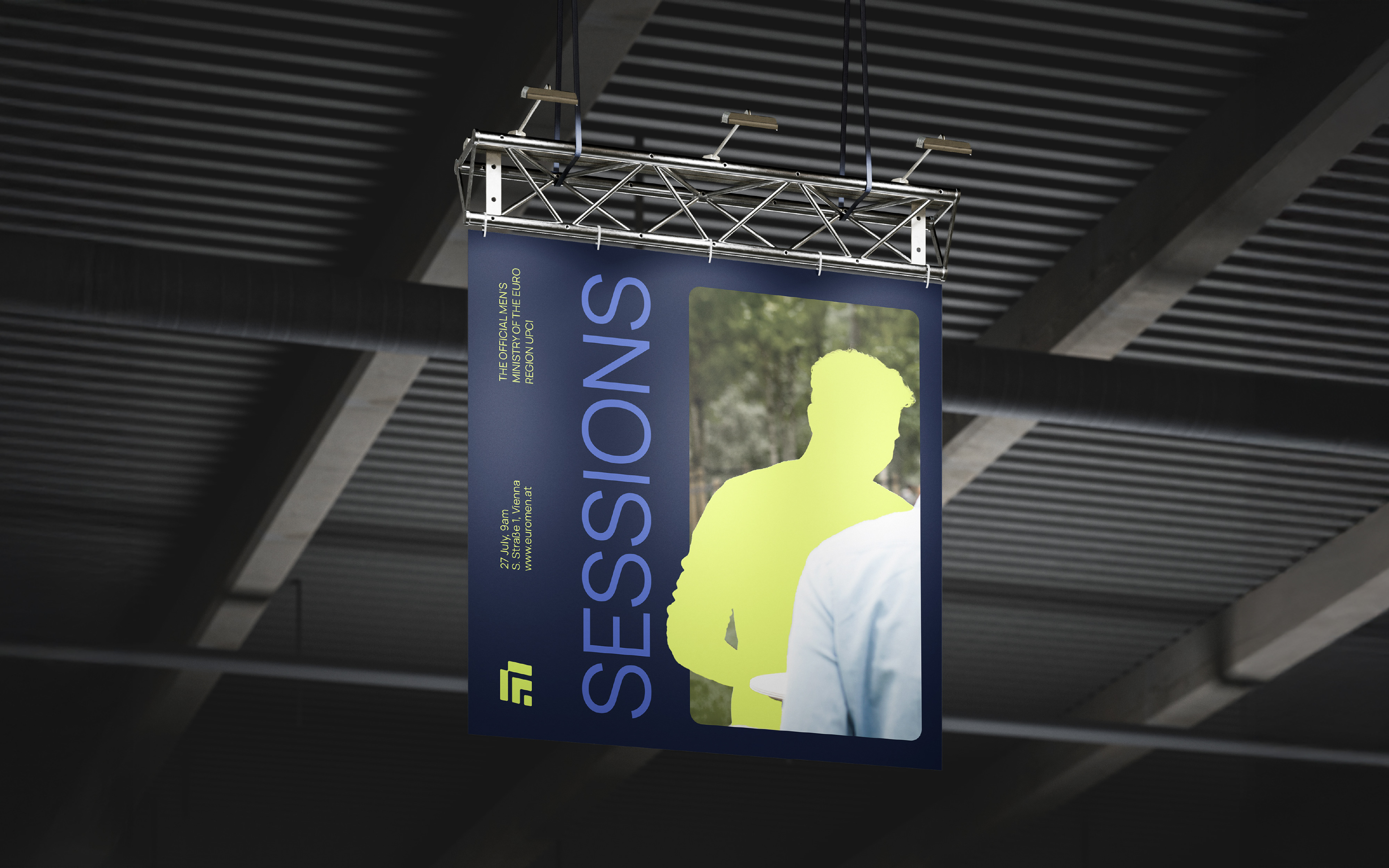
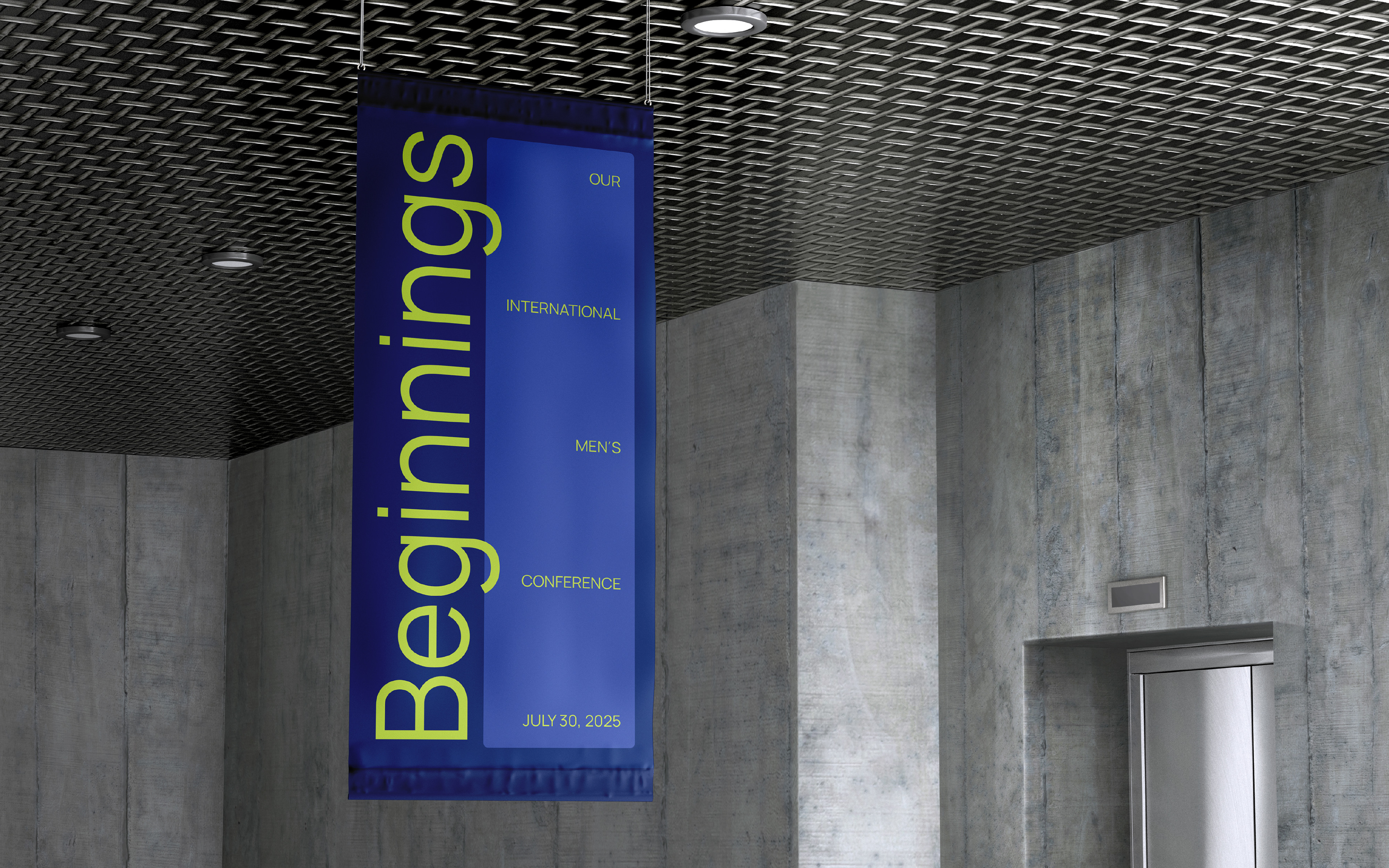
The final result is a clean, modern brand identity that can confidently represent Euro Men across various platforms.