VIENNA BIBLE INSTITUTE
This project focused on developing a compelling and modern brand identity for the Vienna Bible Institute. One that visually communicates its values, mission, and academic excellence. The design emphasizes clarity, professionalism, and spiritual depth through a minimalist yet meaningful approach.
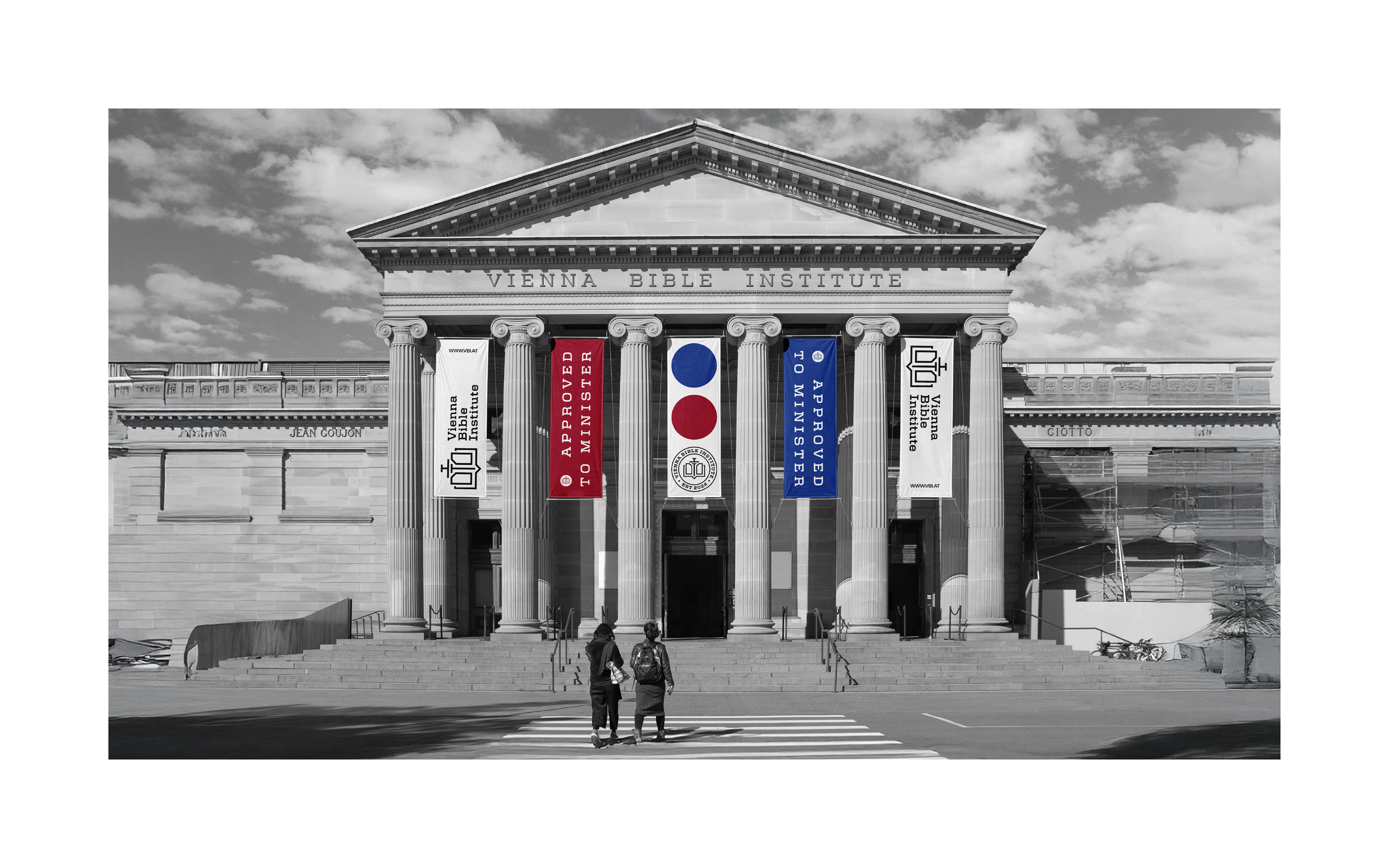
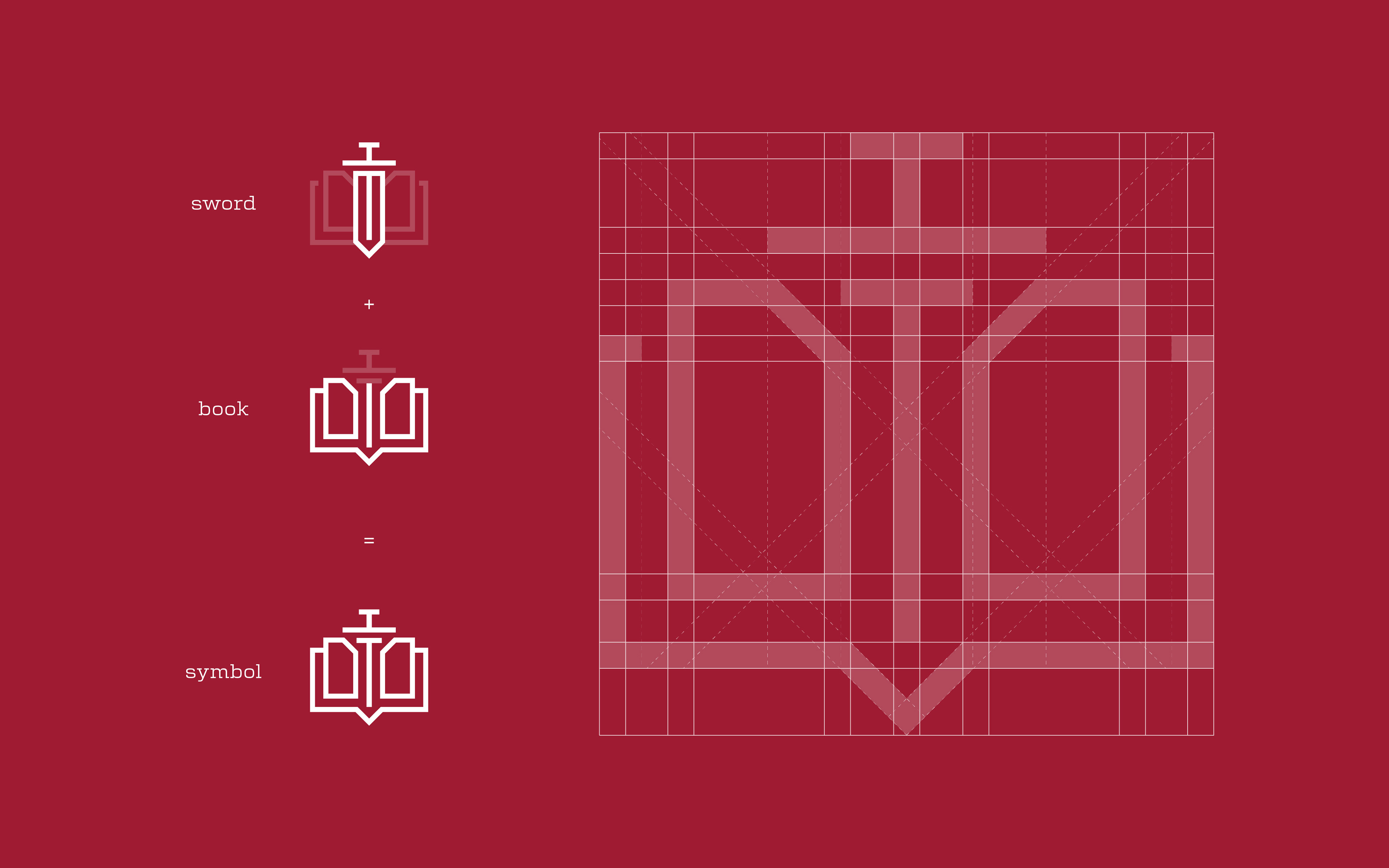
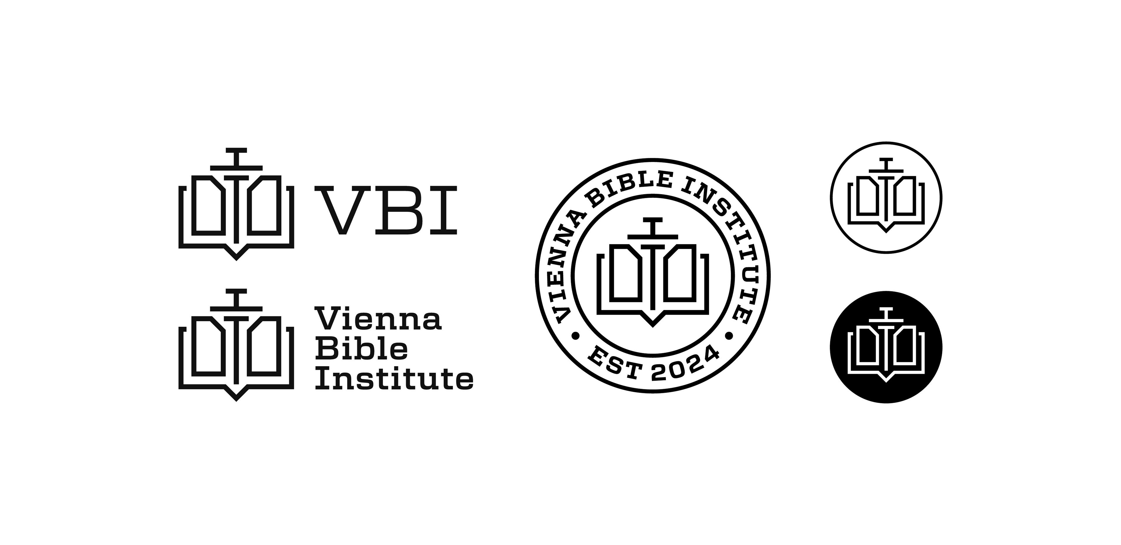
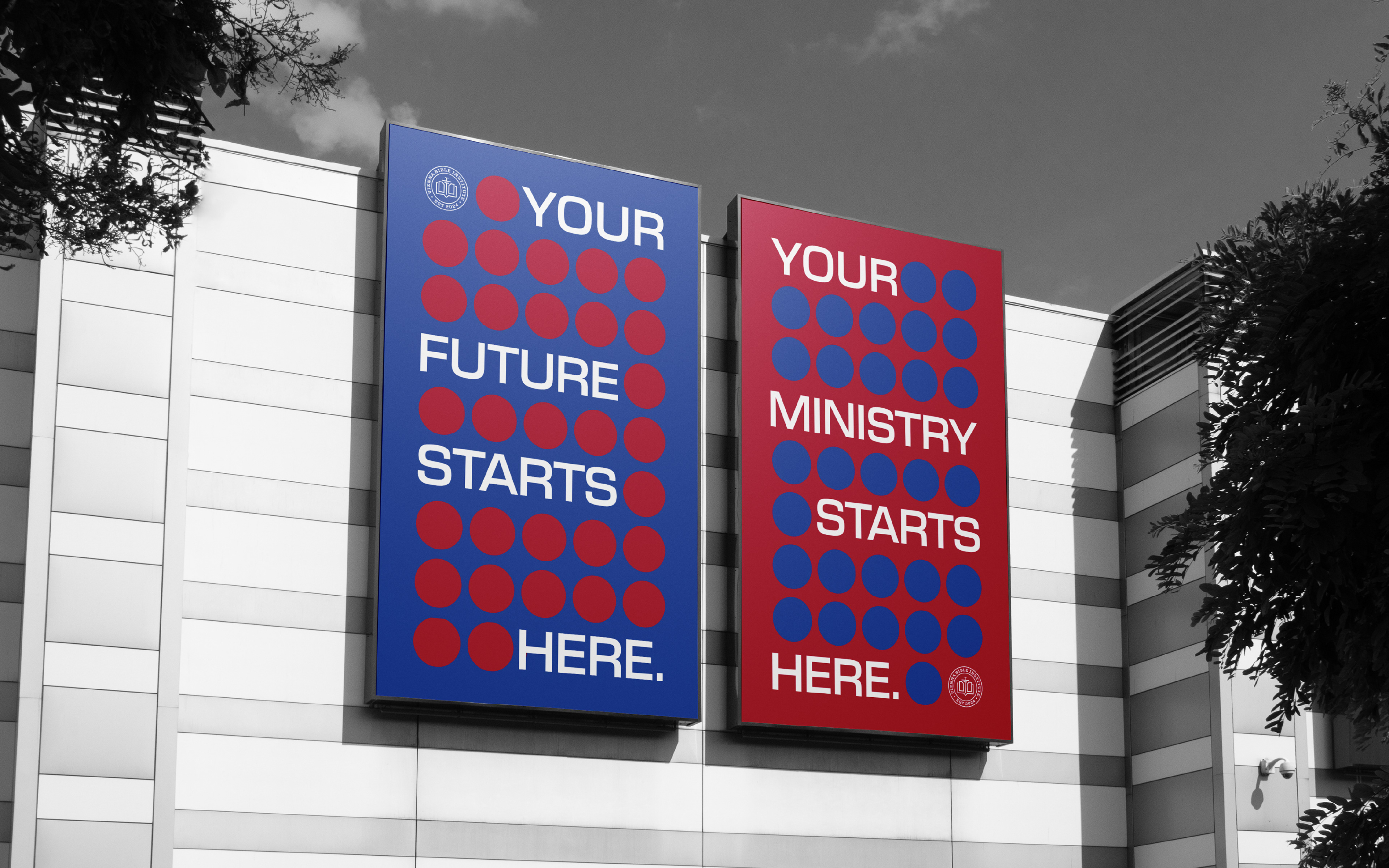
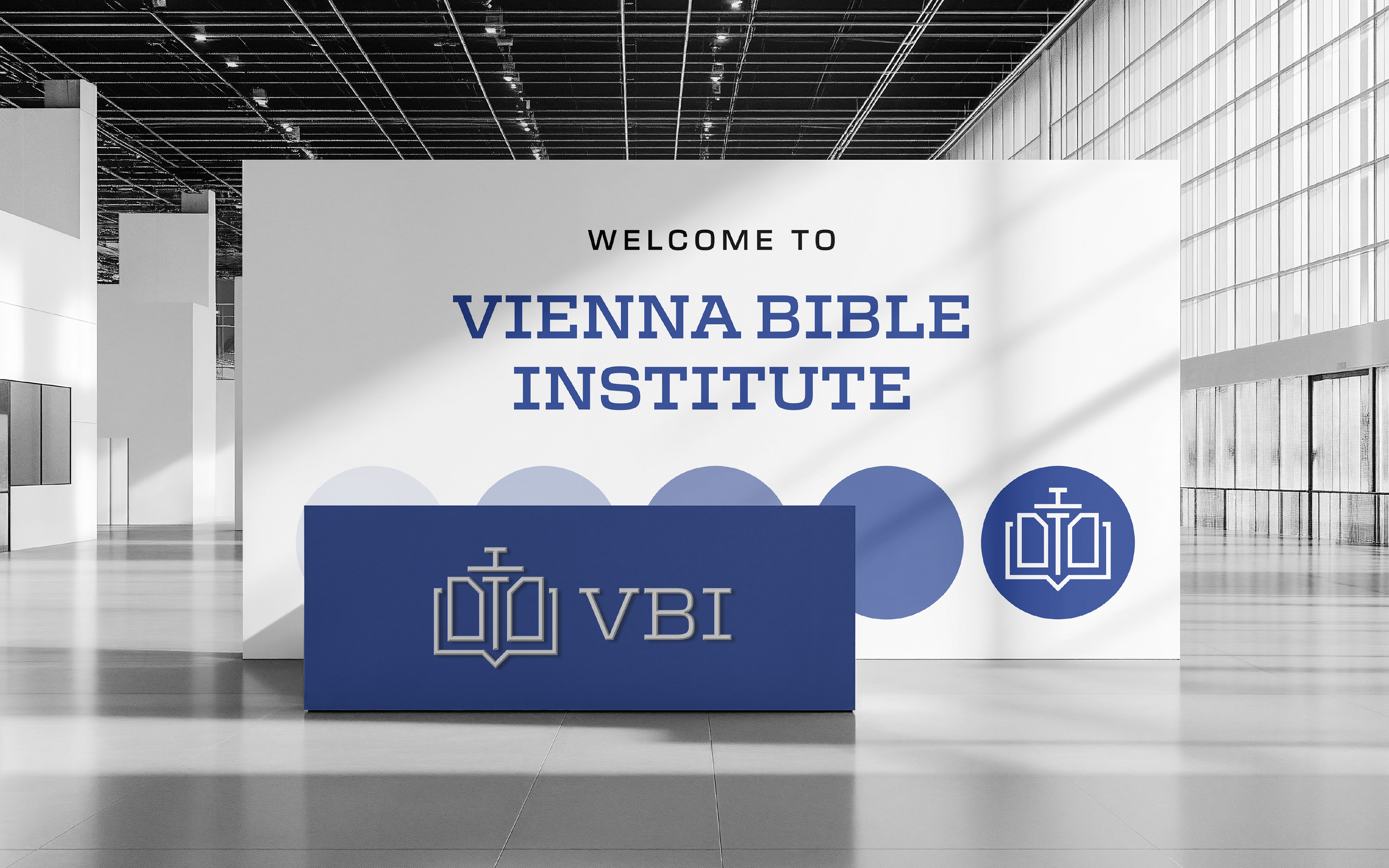
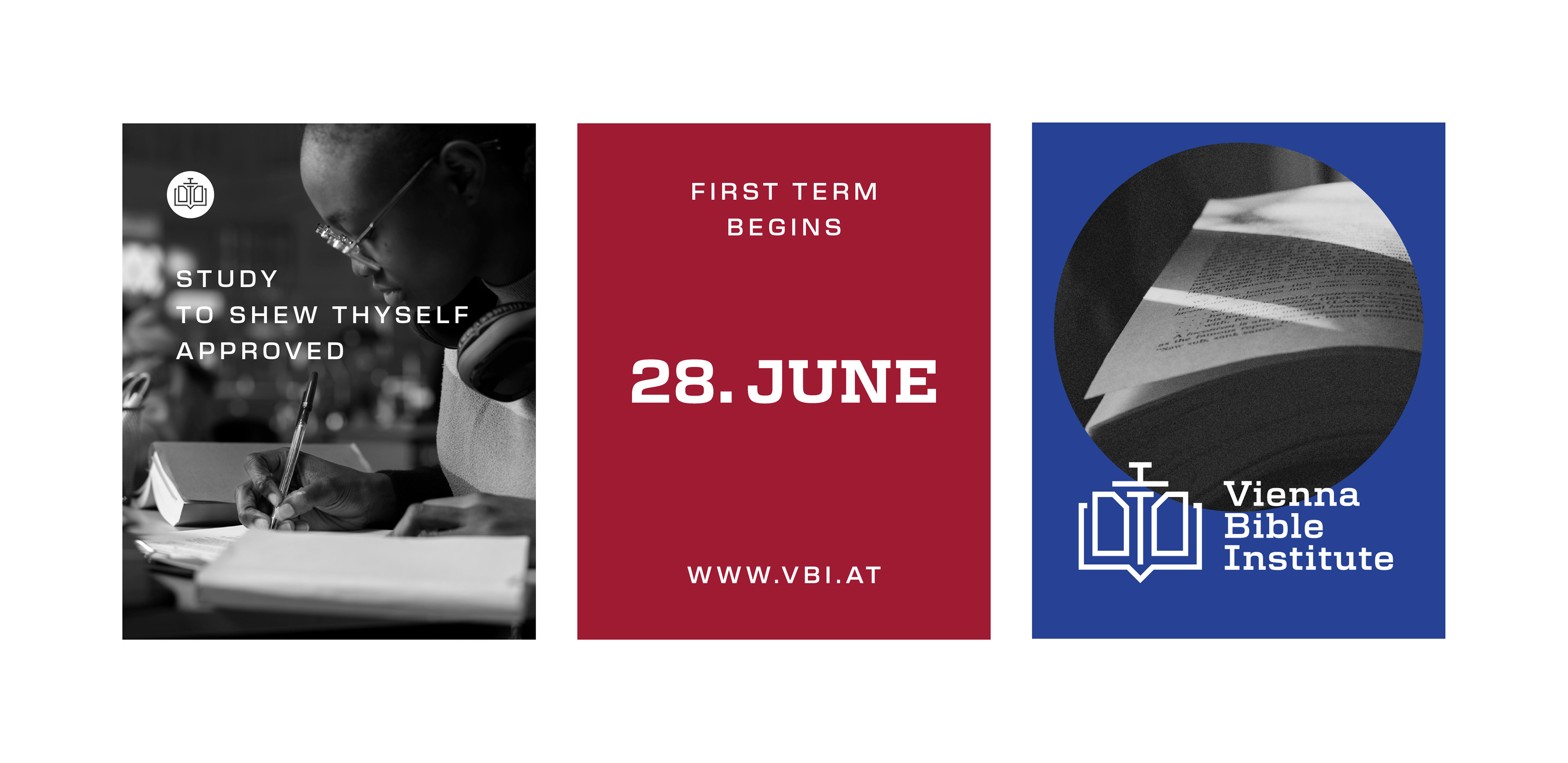
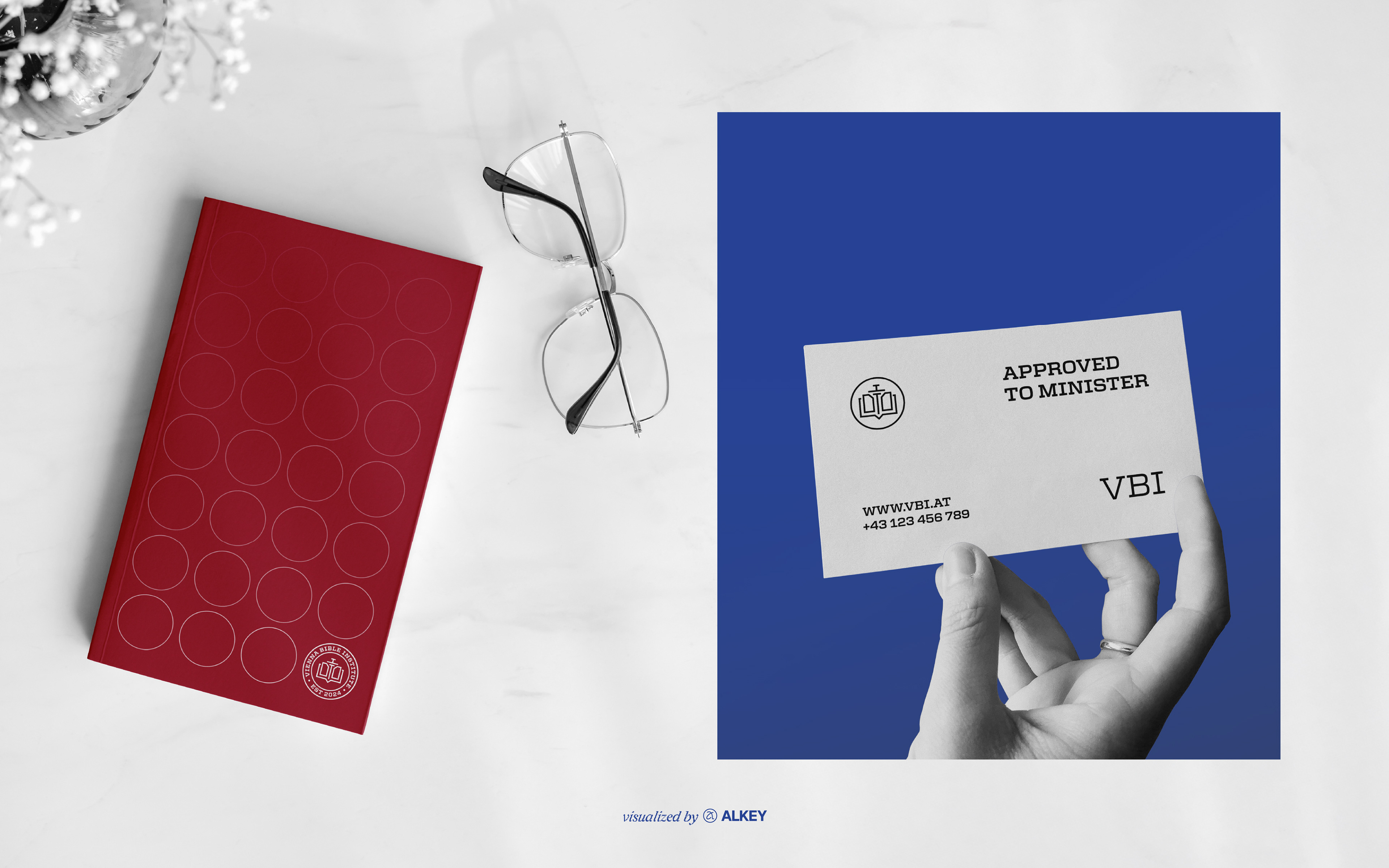
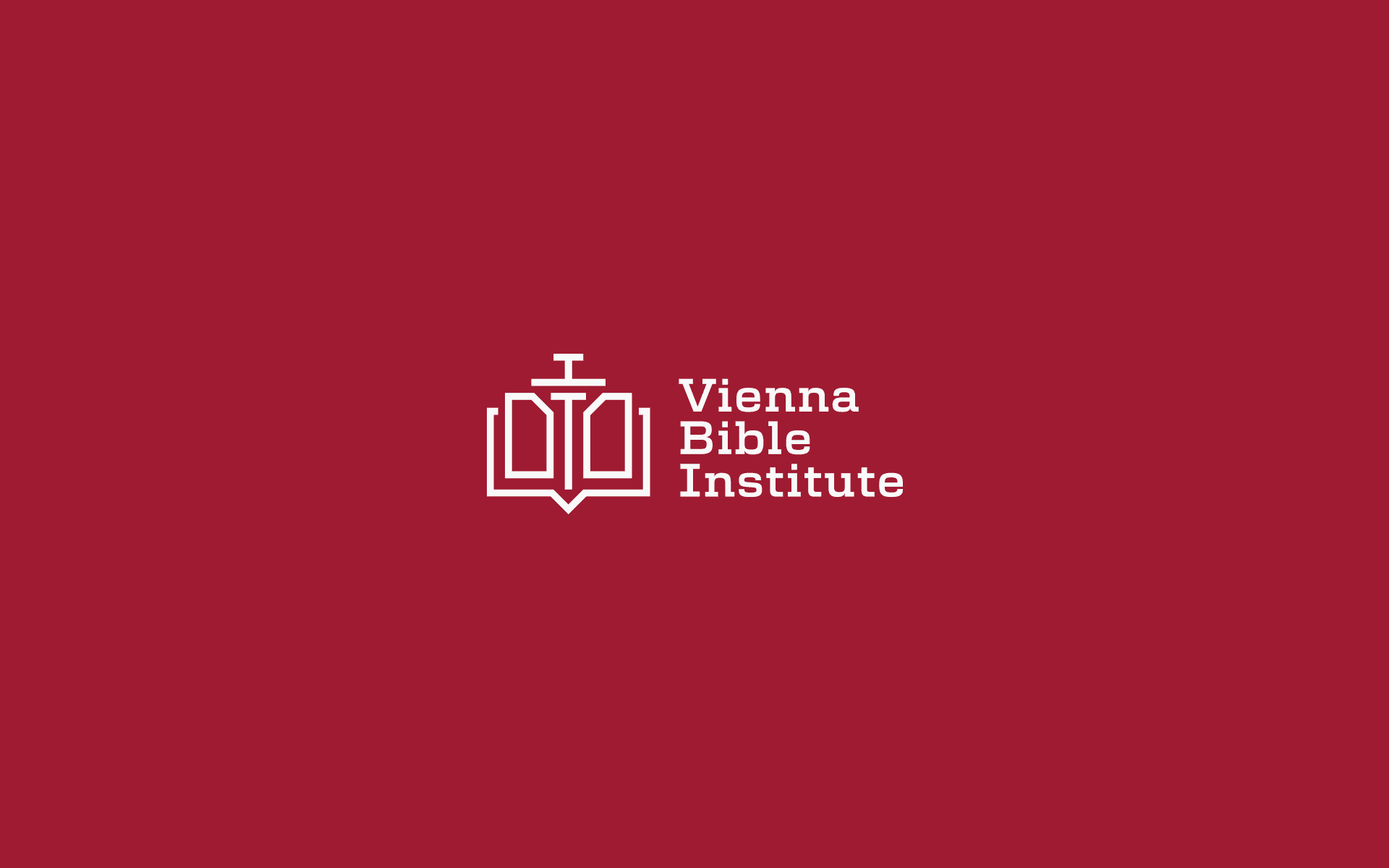
The logo features simple, clean lines that convey a sense of structure, stability, and trust—core characteristics of an institution dedicated to biblical scholarship. A contemporary science serif typeface was chosen to balance tradition and modernity, evoking both the heritage of theological study and the progressive spirit of education.
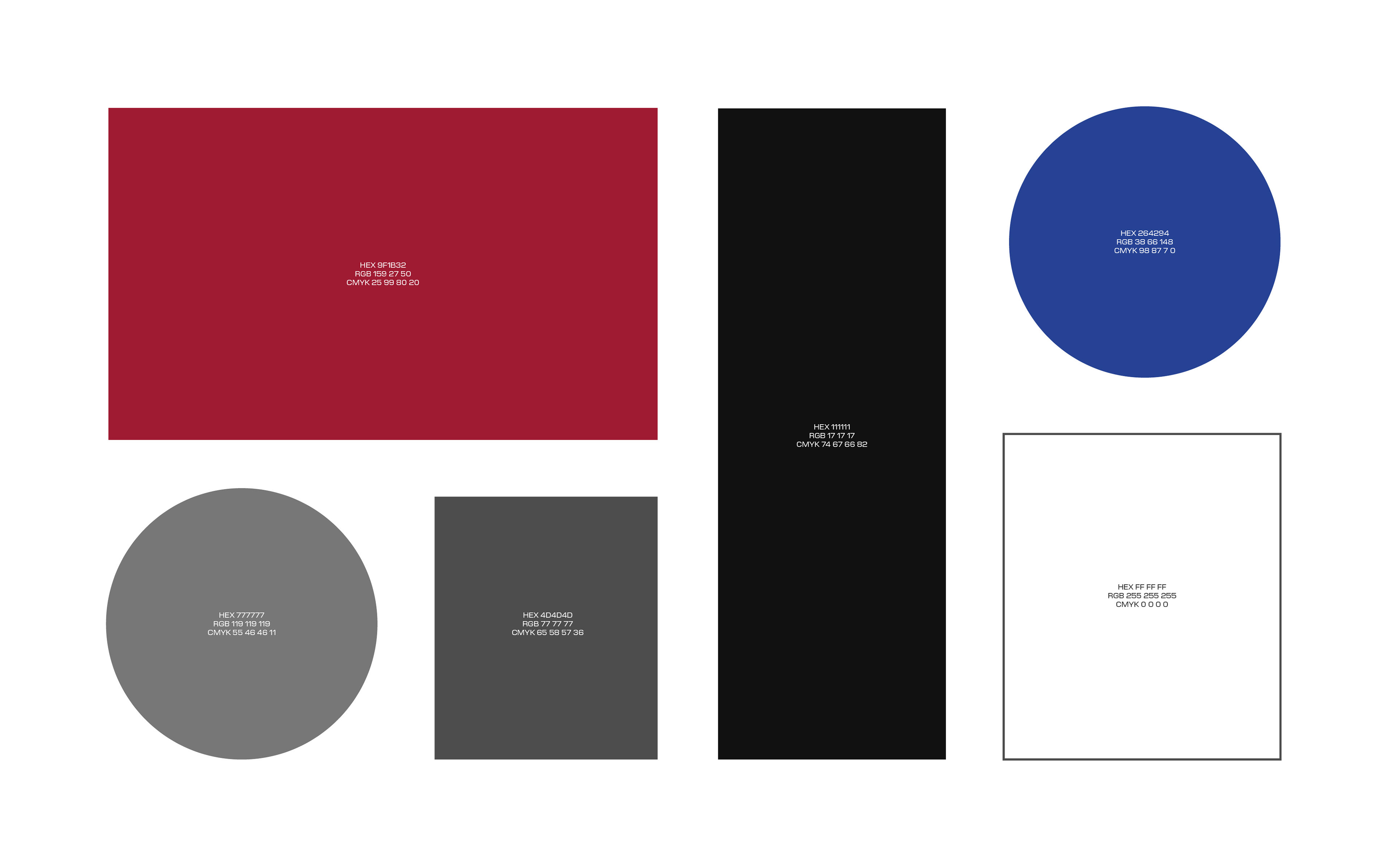
The color palette was selected with symbolic intention. Red represents passion, sacrifice, and the transformative power of faith, while blue symbolizes wisdom, integrity, and spiritual depth. Supporting tones of black, white, and gray provide contrast, timelessness, and visual harmony, enhancing the overall sense of seriousness and professionalism.
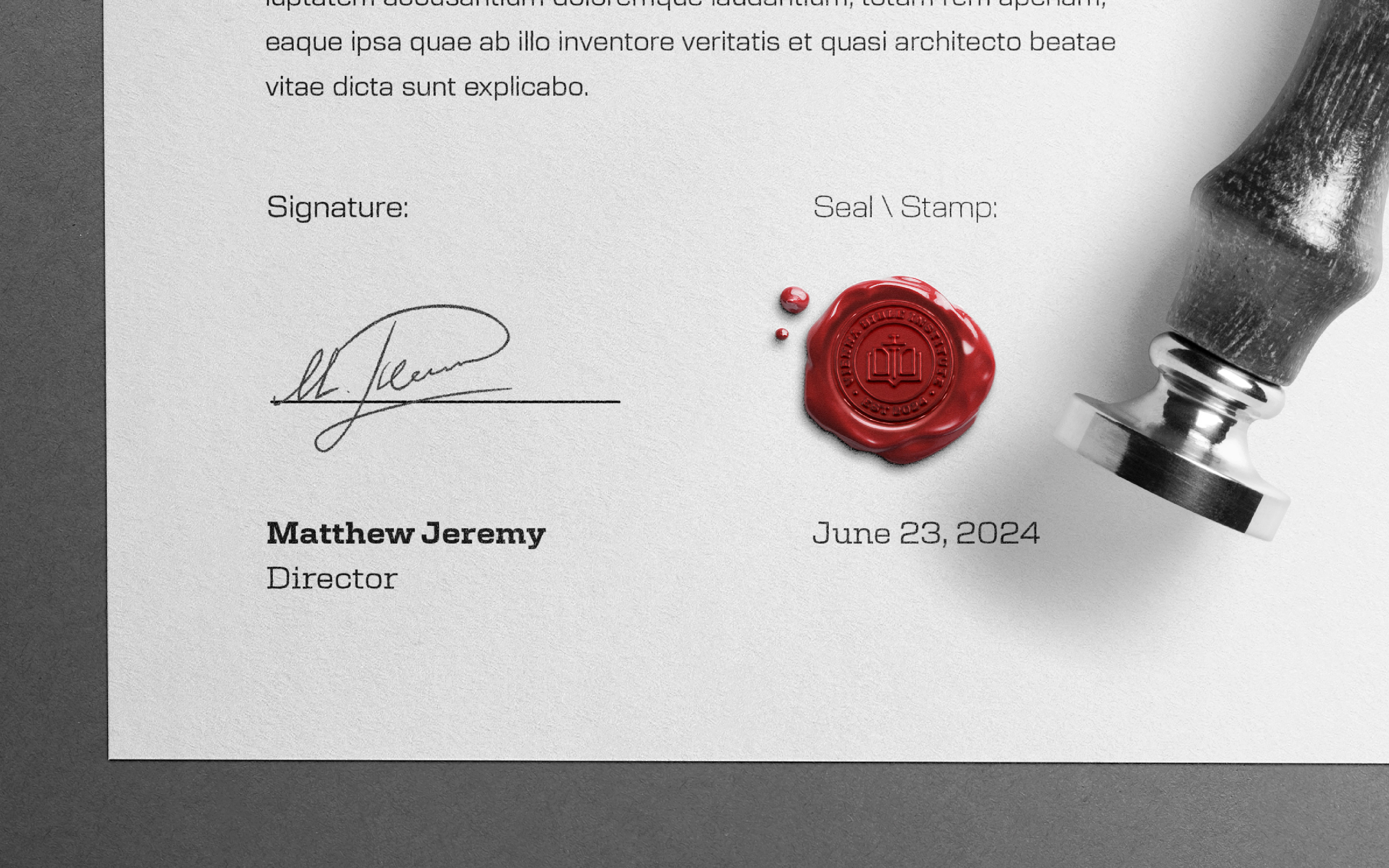
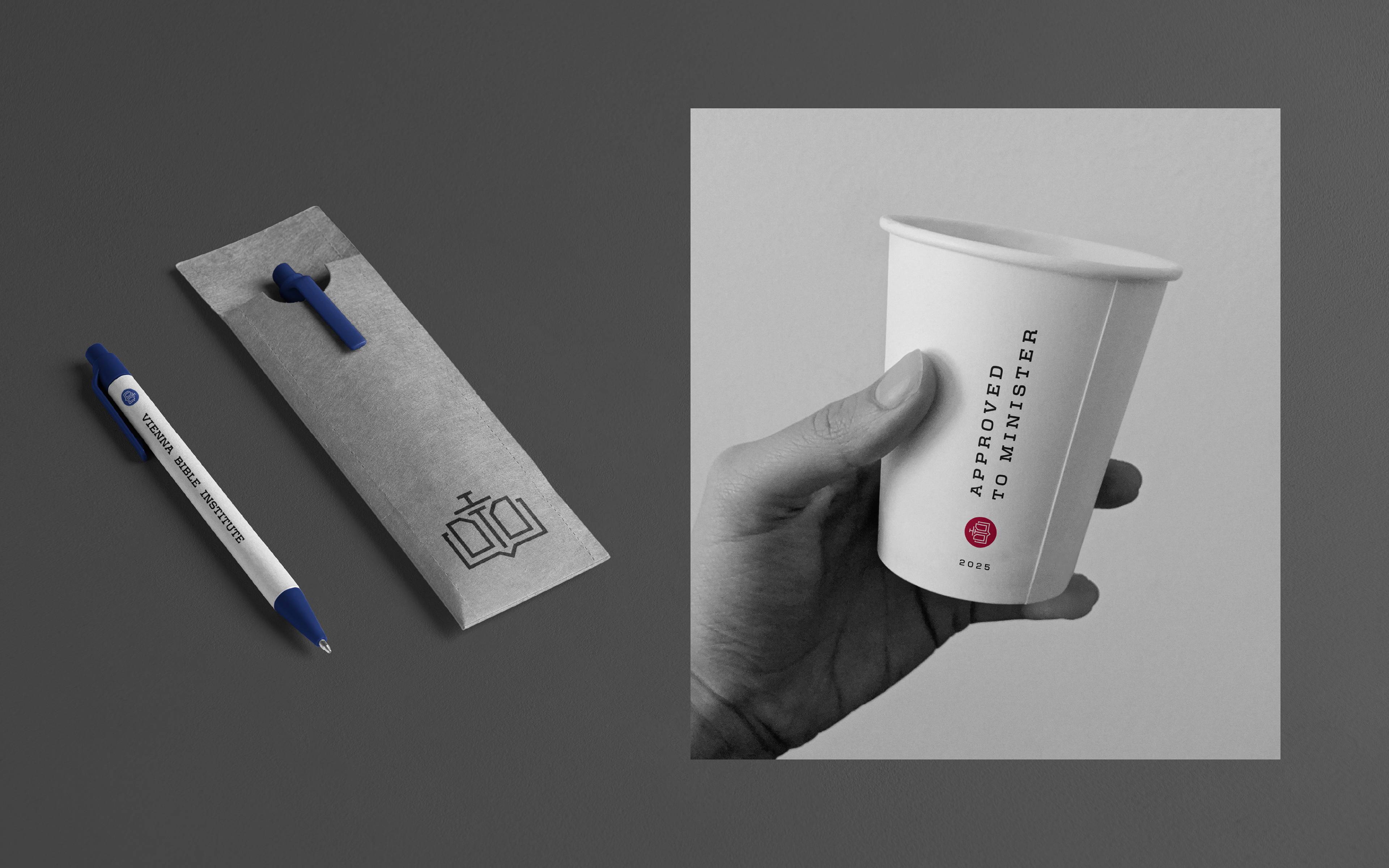
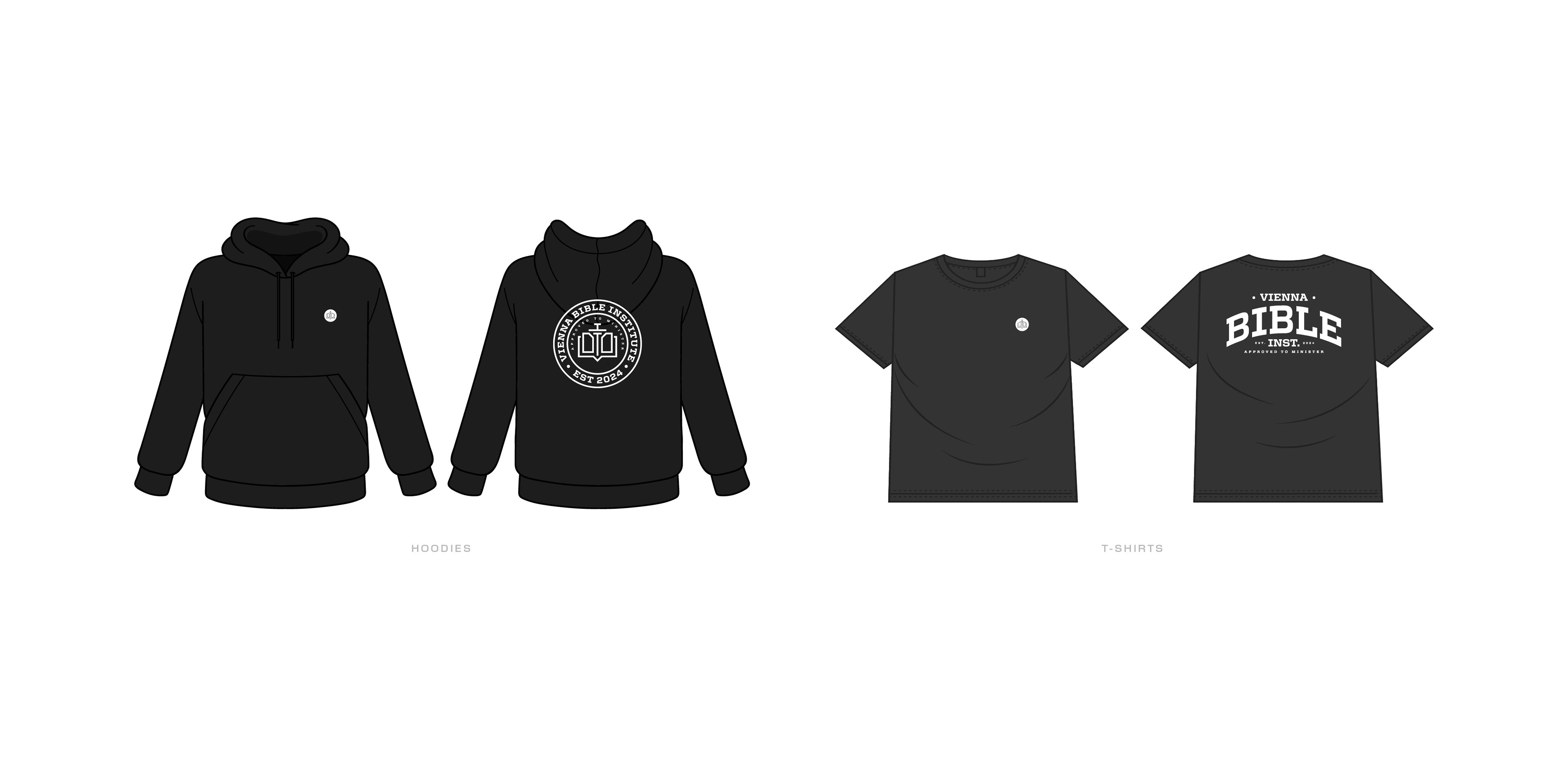
Additional brand elements such as typography guidelines, layout systems, and use-case mockups were developed to ensure consistency across digital and print platforms. The result is a cohesive visual identity that supports the Institute’s reputation and positions it confidently for the future.